Half-baked Revamped News Site - 3 years later
Feb 03, 2020
techThree years ago I reviewed a website from one of the biggest news organizations here in the Philippines and my findings at that time were disappointing in every aspect as a news site. Fast-forward to today, let's see if there are any significant yet nice changes to their site.
Header
Last time I checked the headers, the elements that were supposed to be hidden in their respective view-ports wrecked the whole navbar which it made useless and messy.
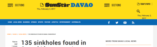
This time I checked the issues were have been fixed. But I noticed that the section links we're moved below in favor of putting "edition" links on the blue making it seem more important for the user to click news from other places rather than the sections which would have made it more discoverable since it is "attached" to the navbar.
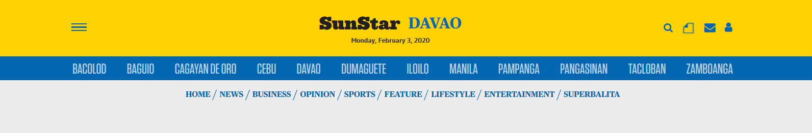
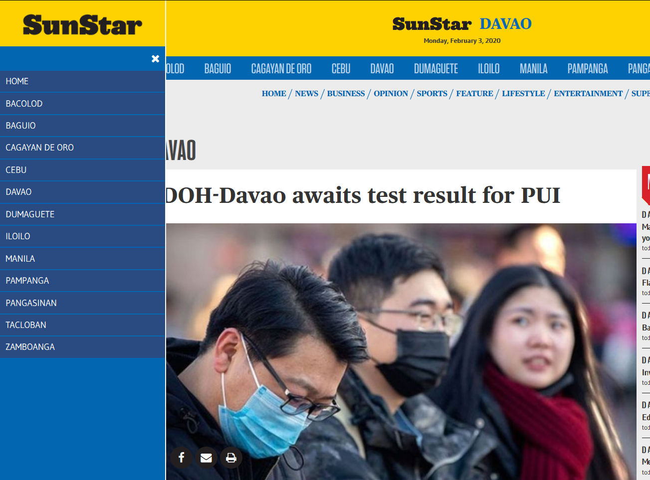
Besides that, from what I've observed, the "edition" links are also available on the side menu when pressed the hamburger menu icon on the top left side. Making the links on the blue part of the navbar redundant.
There are two solutions for this: ditch the "edition" links on the navbar in favor of the side menu and putting the section links back to its right position, hide the side menu on the desktop view-port and move the edition links to the top like any other news site would do.
Article Page Design
Inappropriate font scaling and the boring use of the Roboto font had made me puke in terms of reading the article at that time.

Fast-forward to today and we still have the same issues. Font selections should've been narrowed down to just two: a serif font for big headings and a sans-serif used for reading. The narrow font is unnecessary for this one and should've stick to those two instead.
While the Roboto font has been replaced with the Gudea font (as I've scanned the font-face files, they have not utilized the font properly once again. I'm disappointed they have not utilized the view-port-specific rules for scaling their text and use px instead of the rem for uniform scaling of fonts (and elements in general).
Another one is that the toolbar for scaling font sizes have been moved to the bottom and I don't think it is a necessary change. It makes it invisible to the user and indistinguishable to the colors of the background and the text.

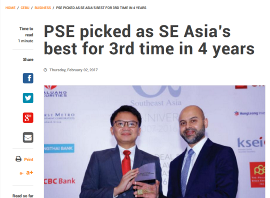
The "card-based" design in total, is not great too look without proper padding a color of the background. I think it is "cramped" rather making it appealing and look cool which defeats the purpose of the design. Colors of the links on the right against the color of the background does not look good when first viewed. Like the navbar, it would've been better to stick to the previous design of giving proper padding to the contents of the article or make the background color of the page all white as seen below:
.png)
Conclusion
While there have been nice improvements to the site, the issues still persists the same as I've reviewed three years ago. Proper typography, contrast, and user experience in general must be prioritized in order to make the site feel like a respectable news site like ABS-CBN News and Rappler regardless of the excuses/reasons they have. Nonetheless, congratulations for the overall improvement of the site and I hope it would gradually be better as many years to come.