Half-baked Revamped News Site
Feb 02, 2017
techI don’t read Sunstar.com.ph every day but just recently I read an article at their website about a new mall soon to be opened at my place and suddenly got my “design”-sensitive eyes in beast mode when I first viewed it.
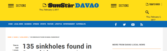
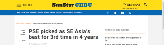
What you see above, is a production site navbar and it is poorly made. The “sections” nav toggle doesn’t work at all and sometimes the nav layout looks fine but still it doesn’t look good when it transitions to one page to another just like what you saw in the image above.

In the front page, the colors of the cities’ links hurts my eyes. It’s a poor choice of color and I don’t think they look fine at all especially if someone who is old and have a degrading vision.

They haven’t used the Roboto font well…
And also the font size doesn’t meet the standards of what a good a news site should be. Also I don’t get distracted easily but the layout of the article needs to be improved as well.
Whoever did this site revamp should fix all of this as it is NOT OK with me. I know I’m the first one who complain about this major site change but it is for the sake of the old people who are the main audience of this news site. I believe a good news website not just have great news to deliver but also the looks and feels should stay and attract readers in order to stay readworthy.